More Organized UI 1.8.4 [Image Heavy]
Mar 14, 2017 16:34:56 GMT
Post by QuietMutt on Mar 14, 2017 16:34:56 GMT
I've recently got into Cereal Soup and I really enjoy what the game has to offer so far but, one small thing that really irks me is the user interface since it's a bit messy and all over the place. I've taken some screenshots and moved some things around in them into places that would make more sense.
There's a couple other things in the character creation screens that also bug me a bit but, I feel like these ones should be addressed the most.
EDIT:
Here's a few more problems to add to the list! I might try and clean up this post later by hiding images under spoilers so it's easier to load
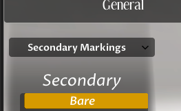
when you choose primary, secondary, or tertiary markings the box that has the marking options moves around instead of staying in one spot. the Primary and Secondary markings have the word "marking" after them but for Tertiary it says "markings." This problem also affects felis
That's all I could find for now! I'll be sure to edit this post once again if I find anything :>
{SPOILER: Move Create Button} 
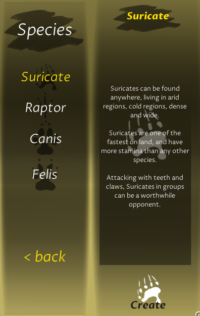
On the character creation selection screen it would make a lot more sense for the create button to below the description of the animal where the user can easily find it after reading the animal description instead of looking for it floating randomly in space there.
{SPOILER: Move Felis Scars}
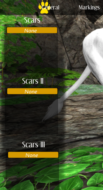
on the suricate and canis add-on 2 pages the scars are on the left side, it would make a lot more sense if the felis scars were also on the right and additional add-ons be on the left
{SPOILER: Move Suricate Body Sliders} 
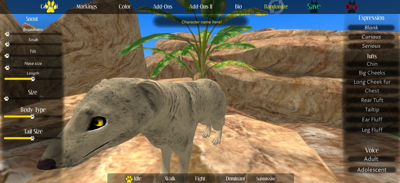
The suricate general page is the only species that doesn't have all of its main body sliders on the left side, it would make a lot more sense to fill that empty space up with the body sliders, along with that I feel like the Size slider should in the Body subsection of the canis and felis as well.
There's a couple other things in the character creation screens that also bug me a bit but, I feel like these ones should be addressed the most.
EDIT:
Here's a few more problems to add to the list! I might try and clean up this post later by hiding images under spoilers so it's easier to load
{SPOILER: Suricate add-ons show up on add-ons 2} 
on the add-ons 2 page the eye styles from add-ons 1 still appears for suricates
{SPOILER: Canis and Felis Primary,Secondary,Tertiary Mark Problems} 
The primary, secondary, and tertiary marking selection is under the markings for canis.
when you choose primary, secondary, or tertiary markings the box that has the marking options moves around instead of staying in one spot. the Primary and Secondary markings have the word "marking" after them but for Tertiary it says "markings." This problem also affects felis
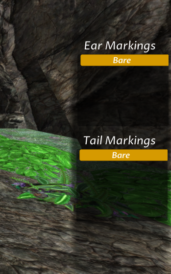
{SPOILER: Move Felis tail,ear to ear,tail} 
the ear and tail markings are in a different spot for the felis compared to the canis, should probably change the felis to have ear, tail, instead of tail, ear
That's all I could find for now! I'll be sure to edit this post once again if I find anything :>


